Overview
The Solace Society is an invitation-only circle built around a single conviction: that intentional hosting is an art form. It gathers people for intimate dinners and curated workshops in settings designed to feel luxurious without excess. NIVO was engaged to give this private club the brand it deserved — a visual identity, a photography presence, and a content launch that would make prospective members feel the atmosphere before they ever walked through the door.
The Challenge
The Solace Society had something most brands spend years trying to manufacture: a genuine atmosphere. The hosting was real, the curation was real, the experience of sitting at Soraya's table was already something people talked about. What it didn't have was a brand system to carry that feeling into the world. The challenge was translation: how do you take something as sensory and intimate as a beautifully set table at golden hour, and render all of it into a brand that makes someone who has never attended feel the warmth and exclusivity of an invitation before they receive one?
Our Approach
The brand positioning landed quickly: hosting is a personality, not a hobby. The Solace Society was not a catering company or an event planning service. It was a point of view — a philosophy of gathering that deserved the same seriousness a fashion house brings to its aesthetic. The visual identity needed to operate in the register of quiet luxury — old-money restraint, not conspicuous elegance. Photography was treated as a brand asset, not documentation. The brief for the shoot was cinematic: details over spectacle, atmosphere over coverage.
The Work
Visual Identity System
Primary logo: a circular seal bearing "The Solace Society" in full with a double-S monogram and laurel wreath — designed to read like a private club crest from the first glance. Two submark variations for flexible application: a dark version and a gold version.
Color Palette & Typography
Five-color system anchored in deep burgundy, forest green, and ivory — rich without being loud. The Seasons as the primary display face; Sloop Script Pro as the secondary voice, flowing and personal. Together they balance formality and warmth.
Event Photography
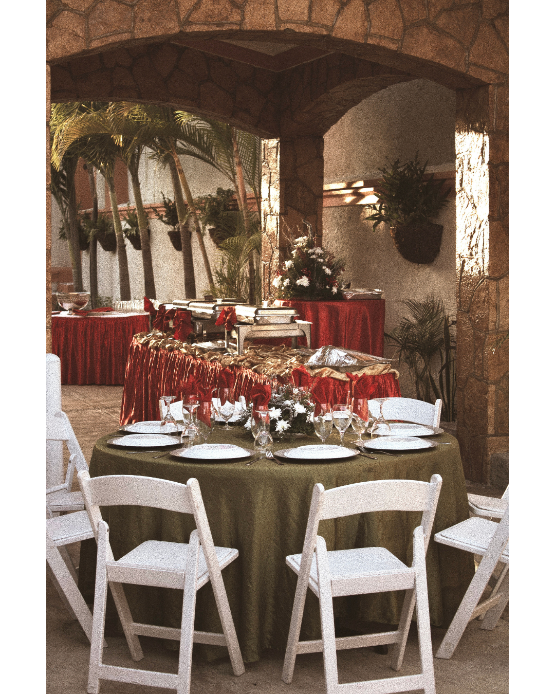
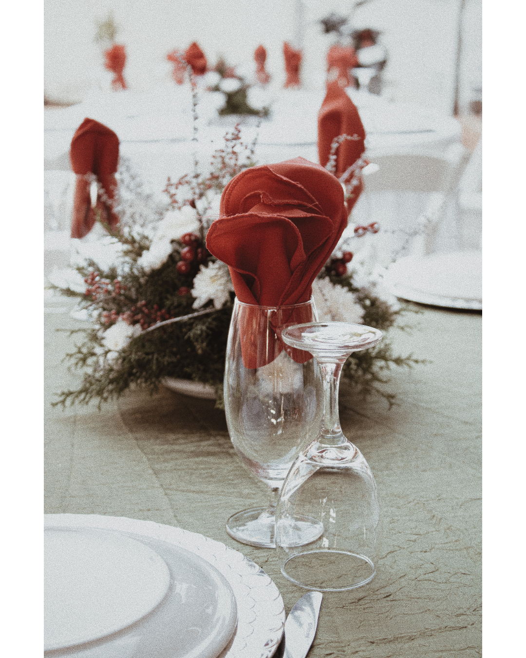
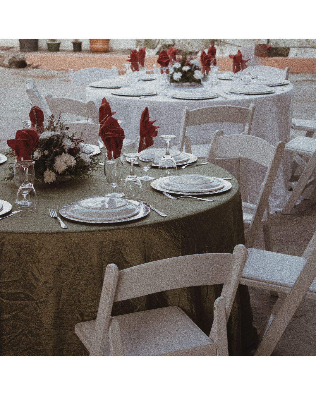
Full coverage of the Society's inaugural dinner — shot on-location at an outdoor stone-walled venue in Haiti, golden hour light, tropical canopy overhead. Detail-first: napkin folds, glassware, place settings, centerpieces. All images treated with a warm, film-grain finish consistent with the brand's quiet luxury register.
Invitation Design
A formal event invitation card — cream stock, script logotype, event photography inset, "Hosted by Soraya / You Are Invited" — sealed inside a cream envelope with the Society's crest on the back. Designed to feel like something worth keeping.
Social Media Launch Content
A nine-slide branded carousel introducing The Solace Society, built around the manifesto copy: "Hosts deserve branding too." Each slide layered brand photography against the olive-green brand background, with editorial collage treatments.
The Outcome
The Solace Society launched with a brand identity that matched the experience it was built around. The photography gave the brand proof — not just aesthetics, but evidence that the atmosphere was real, the table was real, the standard was real. The social content turned a private dinner into a public statement: this is what hosting looks like when it's treated as a craft. For an invitation-only concept, brand is access control. The right visual language communicates exclusivity without saying the word — and makes the people who belong feel it immediately.